Customize your video channel's appearance
To customize your channel’s appearance in Videas, open the channel editor, click Settings in the toolbar, then set your logo, your color and your theme in the Identity tab, and your navigation and thumbnail styles in the Appearance tab. Changes show up live in the preview; click Save to publish.
This guide goes through the Site settings drawer tab by tab: Identity, Appearance and Code (the Menus tab has its own article, Organize the catalog: categories and menus).
Open the Site settings drawer
From your channel dashboard, open the channel editor, then click Settings in the toolbar. A side drawer opens, titled Site settings, with the subtitle “These settings apply to every page”.
It has four tabs:
- Identity (open by default) — logo, colors, default theme
- Menus — header and footer links (see Organize the catalog: categories and menus)
- Appearance — navigation style and thumbnail style
- Code — custom CSS
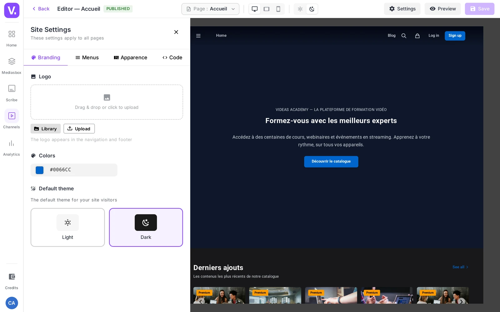
Good to know: changes apply live to the editor preview. You can try out a color or a card style before saving.
The Identity tab
The tab that shapes your brand the most, in three blocks.
Logo
A media picker: upload an image (image formats and SVG are accepted). The logo appears in your channel’s navigation bar and footer.
Tip: go for an SVG or a PNG with a transparent background — crisp on every screen and a clean fit whatever the theme. If your channel is in dark mode, check that the logo stays legible on a dark background (prepare a light version if needed).
Colors
A color picker sets your channel’s primary color: action buttons, links, visual accents on pages and in the player. Enter your brand’s exact hex code. By default, a channel starts on a blue (#3B82F6).
Contrast tip: a color that is too light disappears in dark mode, and one that is too saturated tires the eye. Pick a shade of medium brightness and check it in light and dark.
Default theme
Two cards, Light or Dark — this is the starting theme your visitors will see. The subtitle spells it out: “The default theme for visitors to your site”. Dark mode really shows off the immersive thumbnail styles (Cinematic, Netflix).
The Appearance tab
This tab controls two layout elements: the navigation bar and the video cards.
Navigation style
Subtitle: “Look of the navigation bar on every page”. Three cards:
| Style | Feel described | When to use it |
|---|---|---|
| Transparent (default) | VOD / Netflix style | Shows off the hero banner on the home page |
| Solid | Classic style | Maximum legibility, editorial and corporate sites |
| Pill | France TV style | Strong identity, navigation grouped into a capsule |
Tip: Transparent is very visual but assumes a strong banner on the home page. Solid is the most versatile choice. Pill states a distinctive brand identity.
Thumbnail style
Subtitle: “Look of the video cards on every page”. Eight styles to choose from, each shown with a visual preview in the tab:
Cinematic (default) · Minimal · Poster · Compact poster · Course · Course 2 · Arte · Netflix
The style you pick applies everywhere video cards appear: home page, categories, search. The change is reflected in the preview straight away.
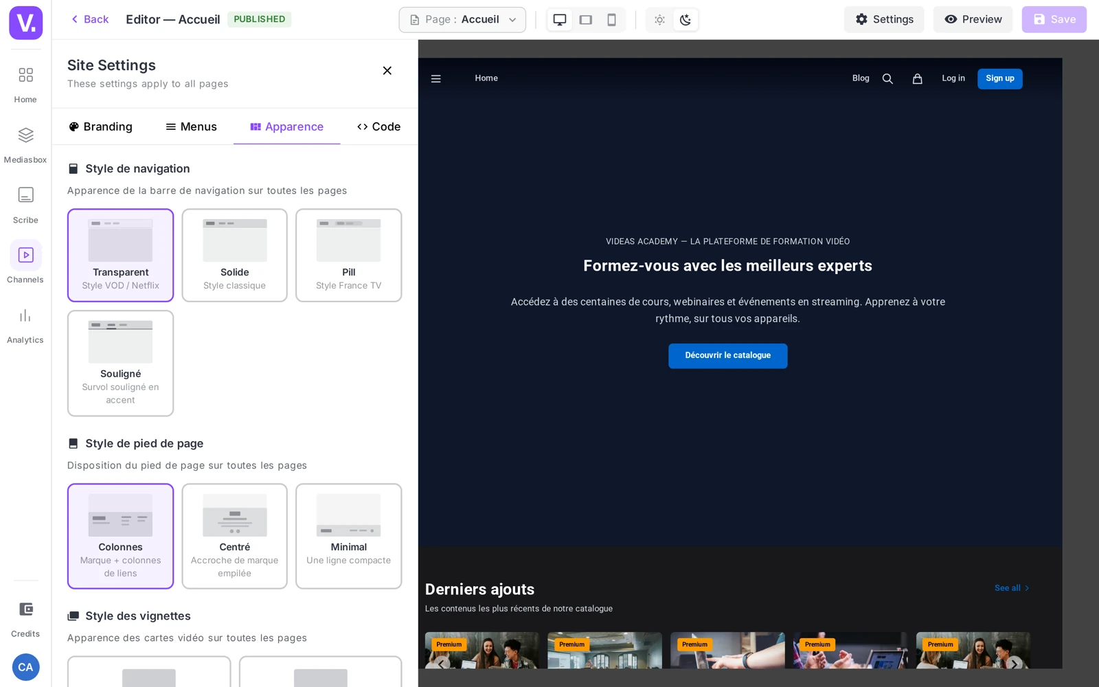
Tip: match the style to the format of your thumbnails. Poster-type styles show off dedicated portrait artwork; if all your thumbnails are landscape, go for a landscape style to avoid cropping. Compare the previews before you choose.
The Code tab
The Code tab exposes a Custom CSS field — “Add CSS applied to every page of your site”. Handy for fine adjustments the standard settings do not cover (spacing, the font of one specific block, formatting details).
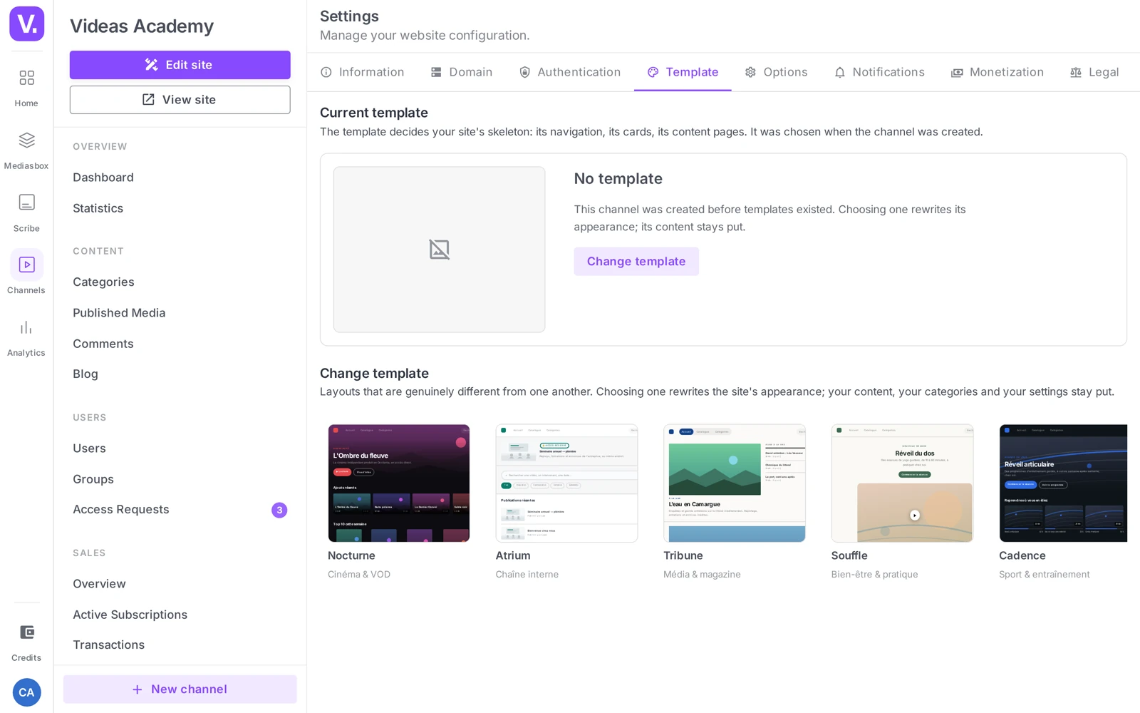
Warning: custom CSS applies to the whole site and can break the layout if it clashes with the Videas styles. Test it in the preview and keep your rules narrowly targeted.
Save
Changes are visible live in the editor preview. There is no auto-save: click Save in the editor toolbar (the button changes to Saved) to apply your changes to the public site.
Tip: before you confirm, check the result on several pages (home, category, video page) and on mobile — open the
your-choice.websites.videas.comaddress (or your custom domain) in a private window.
What you cannot (yet) set here
- No favicon in the drawer — the favicon inherits from the main logo.
- A single primary color is exposed (a secondary color exists internally but is not configurable).
- No dedicated font picker: typography follows from the styles; fine adjustments go through the Code tab.
How far customization goes: the Channels product page shows channels in production, useful for judging what these settings alone produce.
Which navigation style should I choose?
Solid is the most versatile choice: maximum legibility, suited to editorial and corporate sites without demanding anything of your home page.
Transparent, the default VOD style, showcases the hero banner — but it assumes a strong banner: on a home page with no striking visual, the bar floats in emptiness. Pill, the capsule style, asserts a sharper brand identity; it is a stance, not a default.
How do I choose the thumbnail style?
By aligning it with the format of your thumbnails, not with your taste. Poster-type styles — Poster, Netflix — showcase dedicated portrait artwork; if all your thumbnails are landscape, they will produce awkward crops.
Eight styles are offered, each with a visual preview in the tab: Cinematic (the default), Minimal, Poster, Compact poster, Training, Training 2, Arte and Netflix. The chosen style applies everywhere cards appear — home, categories, search — so compare the previews before deciding.
How do I choose my channel’s primary colour?
Take your brand’s exact hex code, then check it in both light and dark theme. That is where the unpleasant surprises live: too light a colour disappears on a dark background, too saturated a colour tires the eye.
A tone of mid-range brightness is the best compromise when your visitors can switch themes. By default, a channel starts on a #3B82F6 blue.
Will my logo stay legible in dark mode?
Not necessarily, and it is worth checking before publishing. A logo designed for a white background can become unreadable on a dark one: prepare a light version if your channel starts in dark theme.
Format matters too: favour an SVG or a transparent PNG. The result stays crisp on every screen and integrates cleanly whatever the theme. The logo appears both in the navigation bar and in the footer.
Can I change the font or the favicon?
No, not from this drawer. There is no dedicated font selector — typography follows from the styles — and no favicon field: the favicon inherits from the main logo.
Only one primary colour is exposed as well. For adjustments these settings do not cover, the Code tab accepts custom CSS, to be handled with care: it applies to the whole site and can break the layout if it conflicts with Videas styles.
Are my changes saved automatically?
No. The editor’s preview updates live, which gives the impression everything is applied — but nothing is, on the public site, until you click Save in the toolbar.
Before committing, check the result on several pages — home, category, video page — and on mobile, by opening your public address in a private browsing window.
In summary
- The appearance is set in the Site settings drawer, via the Settings button in the channel editor.
- Four tabs: Identity (logo, color, theme), Menus (links), Appearance (navigation, thumbnails), Code (custom CSS).
- Identity: logo (SVG/transparent PNG recommended), primary color (hex, default
#3B82F6), Light or Dark theme. - Appearance: 3 navigation styles (Transparent / Solid / Pill) and 8 thumbnail styles (Cinematic, Minimal, Poster, Compact poster, Course, Course 2, Arte, Netflix).
- Live preview; no auto-save — click Save.
Related articles
Screenshots were taken on Videas Academy, an example channel built for this help center. It belongs to a fictional customer, not to Videas: your own channel carries your name, your branding and your prices.