Analyze a video's engagement with the heatmap
The Heatmap tab in your analytics shows, across the whole length of a video, at which moments your audience is still there and where it drops off. Where the completion rate gives you a single overall figure (62%, say), the heatmap shows how that percentage is spread over time.
Open it from the Analytics tab of a video (it is then already loaded for that video), or from the Analytics menu by selecting a piece of content. The heatmap only exists for time-based media (video, audio).
The key metrics
Four metrics summarize engagement on the video over the period:
| Metric | What it measures |
|---|---|
| Total sessions | Number of play sessions recorded |
| Avg. completion | Average percentage of the video watched before stopping |
| Duration | Total length of the video (the reference for reading the curve) |
| Engagement peak | The moment (mm) when the audience is most present |
Reading the engagement curve
The curve splits the video into segments along its length. Hover over a segment to see the play density (the share of the audience still present at that moment) and the absolute plays. The most-watched segment is marked Peak.
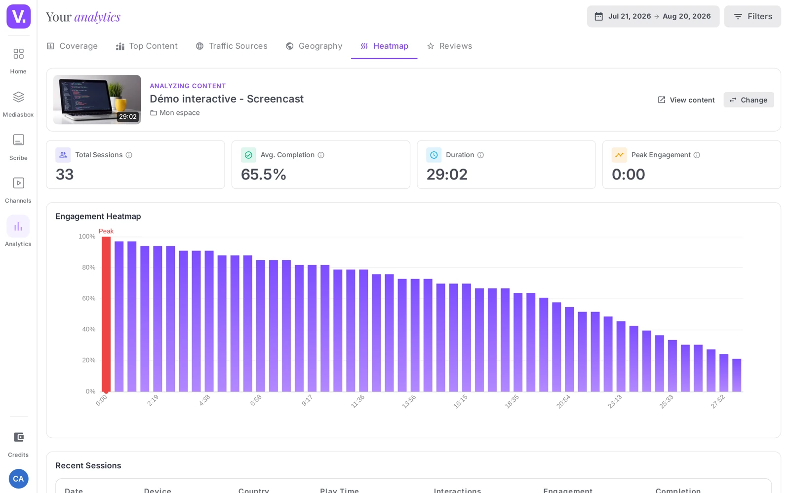
A few useful curve shapes:
- Drop within the first few seconds → intro too long or a misleading thumbnail: get to the point faster.
- Steady plateau → content that holds attention well: build on this format.
- Gradual drop in the middle → attention lost to pacing or length.
- Local rebound → a passage people come back to: a highlight worth promoting.
Good to know about data accuracy
The level of detail depends on the video:
- For the oldest content (uploaded long ago), the curve reflects real detailed data: density measured moment by moment.
- For recent content, second-by-second capture is not in place yet. The curve is then estimated from the average completion rate (a smoothed retention), and the Engagement peak follows from it. The detailed sessions table below may be empty for that content.
In other words: the summary metrics (sessions, completion, duration) are always real; the fine shape of the curve is accurate for part of your catalog and estimated for the rest. Read it as a retention trend, and rely on the completion rate when making decisions.
The recent sessions table
When detailed data exists for the video, a Recent sessions table lists individual sessions with their User (or anonymous), Device, Country, Watch time, Completion, and the number of Skips and Pauses. Many forward skips signal a video perceived as too long; many backward skips, dense content that people replay.
What it is for
- Optimizing an intro: a sharp drop in the first few seconds is the most common signal to fix.
- Spotting the highlights (the peaks) to turn them into social clips or chapters.
- Calibrating your lengths: compare average completion across videos of different lengths to find your ideal format.
Tip: only analyze the heatmap once you have a few dozen sessions — below that, the curve is too noisy to be reliable.
The other measurement angles: the Analytics product page places the heatmap among the other views — reach, geography, distribution sources.
Why is my curve smooth and the sessions table empty?
Because second-by-second capture is not yet in place on recent content. For those, the curve is estimated from the average completion rate — a smoothed retention line — and the Recent sessions table can stay empty.
Content uploaded a long time ago shows a curve based on real detailed data. Worth remembering: the summary indicators (sessions, completion, duration) are always real; only the fine shape of the curve is estimated on part of the catalogue.
What does a sharp drop in the first few seconds mean?
That your intro is too long, or that the thumbnail promised something the video does not deliver. It is the most common signal and the most rewarding to fix: the first minute decides everything that follows.
Three other profiles read just as fast. A steady plateau signals a format that holds — build on it. A gradual drop in the middle betrays a pacing or length problem. A local rise marks a passage people come back to: a strong moment, a natural candidate for a social clip or a chapter.
How many sessions does the heatmap need to be reliable?
A few dozen at least. Below that the curve is too noisy: a single viewer abandoning after ten seconds visibly distorts the line.
On a new video, let a few days pass before drawing conclusions. The average completion rate, by contrast, is readable earlier.
What do the skips and pauses in the sessions table mean?
Many forward skips signal a video perceived as too long: the viewer is hunting for the part that interests them. Many backward skips, conversely, reveal dense content people replay — a sign of value, not of failure.
Those columns only appear when detailed data exists for the video. They complete the curve by saying how the viewer navigates, where the curve only says where they are still present.
Does the heatmap exist for images and documents?
No. It only makes sense for time-based media — video and audio — since it measures audience presence along a duration.
For a document or an image, the relevant indicators are elsewhere: opens, unique audience and time spent, in the Coverage tab.
In short
- The Heatmap shows retention along a video (play density at each moment), with an Engagement peak
- Only for time-based media (video, audio)
- Real summary metrics (Sessions, Avg. completion, Duration); real curve for older content, estimated (from completion) for recent content
- The Recent sessions table appears when detailed data exists
- Read it as a trend, with at least a few dozen sessions
Related articles
Screenshots were taken on Videas Academy, an example channel built for this help center. It belongs to a fictional customer, not to Videas: your own channel carries your name, your branding and your prices.